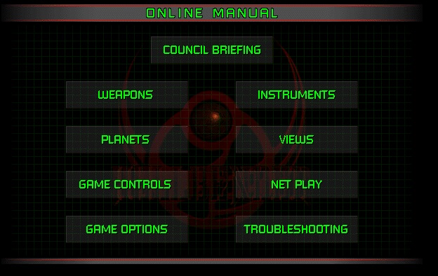
Okay, here we go! Finally made some real progress on this thing. I built the skeleton of the site a few days ago. Got a background and stuff that I like, which was partly inspired by the Hellbender user guide (pictured below)

Not a 1:1 of course, but after seeing this, I couldn't resist basing my own site off of it! The basic framework went up about three days ago, and I've already gotten a bunch of hits, which is wild to me! Apologies to those who were drawn in by the thumbnail or whatever and got an empty page for their troubles.
I've embedded the guestbook that I set up through Atabook on the Guestbook page, so if you're so inclined, please feel free to sign it and let me know what you think of the site so far!
Also, the
footer at the bottom of the page (it should be there by the time you're
reading this) is not a joke! I've been building this website so far in
Microsoft FrontPage 5.0; or at least, that's what the automatically
generated markup tags call it. You're more likely to know it as FrontPage
2002, instead. There are some growing pains with it, I admit; how the
website looks in FP doesn't translate directly when I put the code into
Neocities. The main "issue" at the moment is the borders of the
tables/frames aren't the right colors yet, but I'm sure I'll find a
workaround at some point. [EDIT: A workaround was indeed found! FP stipulates bordercolorlight and bordercolordark, but no regular bordercolor tag, so that was all it took] On the upside, there's no drama with translating
the buttons 1:1 since I made those myself in Photoshop! Very simply done
with the elliptical tool and a gradient, but I like how they turned out.
I don't have an FAQ page,
and I don't really plan on adding one, but for now, I'll get ahead of some
questions that I anticipate at least a few people might have.
WHY BUILD YOUR PAGE IN
FRONTPAGE INSTEAD OF JUST DOING THE HTML YOURSELF?
I know a decent amount of HTML, and some CSS, but I don't really find
it enjoyable to plug away at code to build something from scratch, which
probably makes me sound kinda lazy (which isn't entirely wrong). For now,
I much prefer this method of building in a WYSIWYG editor, and then doing
what tweaks I can on the backend as needed. Plus, it's just fun. I
remember playing around with FrontPage on the outdated computers at my
school when I was a little kid, making very simple pages for class.
Besides, for the type of page I'm making (not super polished or stylized,
very Web 1.0) it feels like a pretty authentic pipeline in its own way.
WHY MAKE A WEBSITE AT
ALL? WOULDN'T IT BE EASIER/BETTER TO USE SOCIAL MEDIA TO UPDATE PEOPLE ON
WHAT YOU'RE DOING?
In some regards, it probably would be "easier" sure. But I'll say it
straight; I hate social media. It sucks. It's a cesspit, and I don't find
it fun to use. The thought of updating a Twitter (sorry, "X" -- Musk can
go jump in a lake) or Instagram, and planning "content" for those kinds of
platforms feels like a chore that I don't want to engage with. I'm of the
belief that being online should be a fun experience the majority of the
time; if that means social media for some people, then power to them. It's
just not for me.
Plus, there's some
added hurdles to it, IMO; first, your account doesn't belong to
you, as such. I've known people whose accounts have been suspended for no
apparent reason, or they've been locked out and can't recover it. This
website is, for all intents and purposes, mine. As much as something can
be "yours" on the internet, I guess. But more to the point, I can make it
look how I want, and anything I post here will be (in theory, heh) easy to
find, no matter how long ago it was posted. And if people are interested
in what I do and what changes, my page will show them all of it. No
algorithmic BS. This method, to me, is simple, clean, and genuine. And
that's what I want.
YOU KNOW YOUR WEBSITE
DOESN'T NEED TO LOOK LIKE A WEB 1.0 ATROCITY, RIGHT? PEOPLE MAKE
SOME AMAZING THINGS THROUGH NEOCITIES.
That's very true! But as stupid as it might sound, I like
having my website look this way! I've seen some of the sites that people
make on Neocities though, and they're fucking amazing. Huge props to the
real codeheads out there who are making their pages look like some kind of
awesome Internet art installation! That's genuinely really cool.
ARE YOU GOING TO JOIN A WEBRING AT ANY POINT?
Maybe! I think I want to do more work on the site and get a video or
two up first. I know the general idea of what a webring is, but I don' t
know much about them, or how my site would fit into that framework just
yet. Maybe someday!
Alright, I'll leave this update post hereabouts, I reckon. Generally speaking, I don't think posts I make here will be of the "personal life" variety. It'll be more about the website, videos, and things I'm working on, rather than things going on in my life. I've never been one much for "blogging" of that sort. Also, I'm noticing as I type this that the table growing is leaving a big empty space under the buttons on the left. Gotta decide what to do about that. For now though, that's the update; and once again, please feel free to go over and sign my Guestbook!
Peace out and game on, I'm
off to keep editing my upcoming video!
Lux
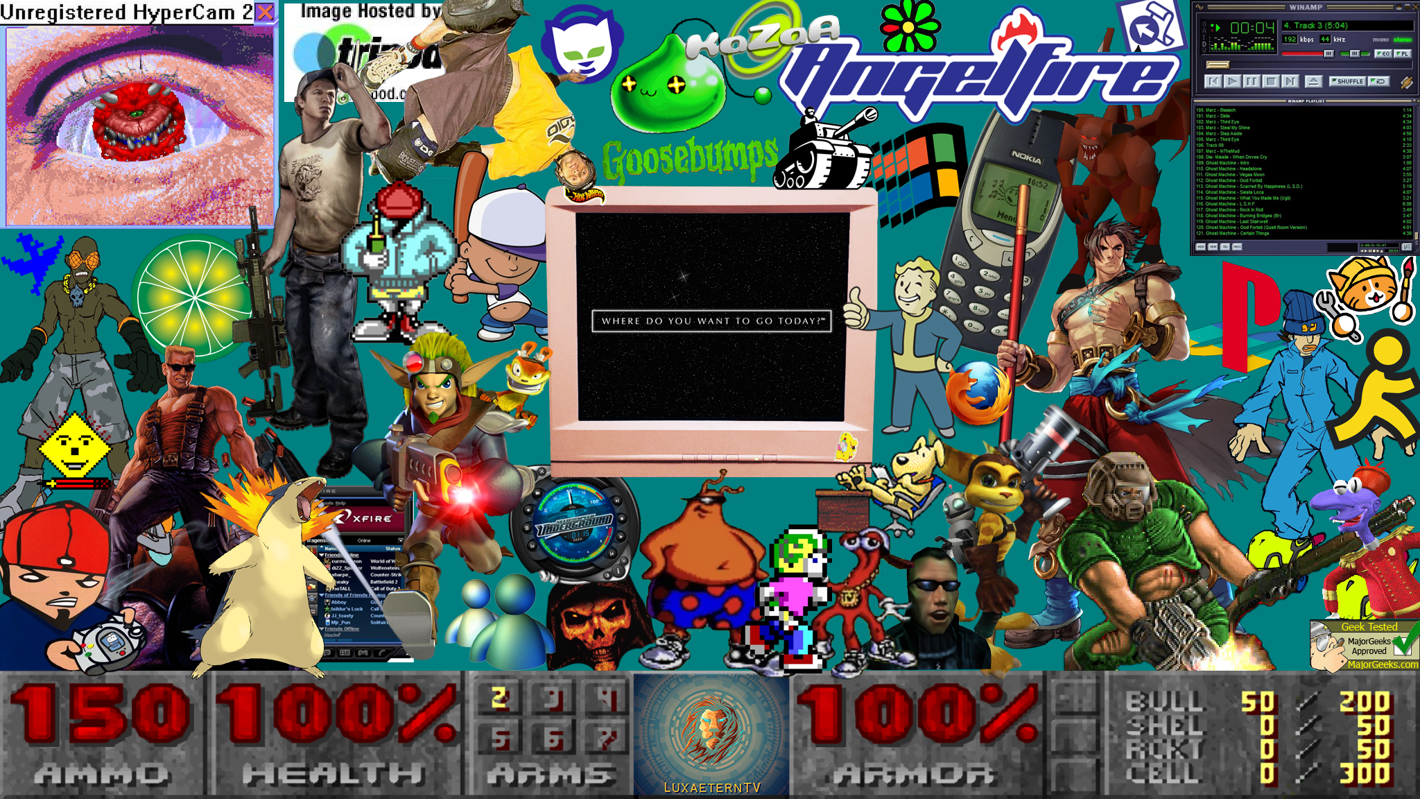
EDIT: I messed UP. I didn't end up doing as much editing today as I was planning on, because I decided to make an absolutely bonkers YouTube channel banner instead. Problem is, I only looked at the max recommended dimensions, and didn't account for cropping, so you can't even SEE most of it LOL
Ah well, I'll figure it out tomorrow. For now, I'll post it here in its complete glory. Click it for the full resolution image!

A cookie and two high fives to anyone who can name everything in the image! If you can't, and you're busting to know, just hit me up and I'll clue you in!